Think of the Instagram carousel as a tiny, handheld comic book you control with a thumb. Each swipe is a page turn, and each page can reveal character, setting, or a reveal that rewards patience. Start your design by roughing out the hero frame with an AI photo generator so you know what the final “splash” image will look like before you design the panels that lead into it. Dreamina is an easy place to mock up that splash and iterate on mood, color, and composition—then we’ll stitch a narrative that makes viewers want to swipe just one more time.
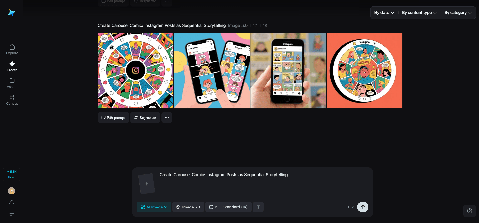
Carousels are uniquely forgiving: you can pace scenes, add captions that act like speech bubbles, and layer information so the full story only lands if someone completes the sequence. That’s attention economy at its sweetest—you get repeat engagement and a stronger memory trace. Below are ways to think like a comic artist, broken into panels, beats, and production tips, plus a short Dreamina workflow to prototype your visual arc.
Why the Swipe is Your Secret Weapon
A single image must stop a thumb. A sequence can do more: establish tone, build tension, then pay off. Use the carousel structure to control rhythm: hook → complication → payoff → epilogue.
- Hook: stop the thumb with contrast, mystery, or emotion.
- Build: show detail, context, or failed attempts; let tension rise.
- Payoff: satisfy with a reveal, transformation, or actionable idea.
- Epilogue: end with shareable content—a memorable quote, a micro-tutorial, or a save-worthy checklist.
The more deliberate your beats, the more the swipe becomes compulsive rather than passive.
Panel Types That Make Swipes Addictive
Not every slide needs the same energy. Mix tile types to keep the narrative fresh.
- Establishers: wide, cinematic frames that set place or mood.
- Close-ups: tight details—hands, screens, notes—that cue intimacy.
- Diagram tiles: minimal overlays that explain a mechanic or metric.
- Reveal tiles: the payoff image or transformation that reads as the climax.
- List tiles: a two- or three-point takeaway that’s screenshot-friendly.
Sprinkle human faces and candid moments; people empathize with expression and that increases interaction.
Pacing and Rhythm: Think Like a Drummer
A carousel’s tempo is made by spacing and contrast. Give the eye a rest with quiet panels and then punch with bold imagery. Try these pacing patterns:
- Rapid-fire: five quick, high-energy tiles for product teases.
- Slow burn: alternation of wide and close-up frames for stories.
- Microcase: problem → choices → outcome in three slides for tutorials.
Aim for 6–12 slides: enough to tell something substantial but not so many that users bail.
Composition Tips for the Swipe-First Feed
Design for the phone. Keep central action within a tight safe zone so crops and Instagram overlays don’t obscure it. Use a consistent left-to-right flow: place hints on the left that resolve on the right. For visual continuity, repeat a motif—color strip, icon, or hand gesture—that appears in multiple slides; repetition binds the sequence together.
Typography should be large and punchy. A short headline per slide is a good rule: lean sentences, bold verbs. If you use overlays, add subtle drop shadows or semi-opaque panels behind text for legibility.
Interactive Ideas That Make Stories Stick
- Embedded micro-surveys in slide 3 (“Which would you choose?”)
- Reveal frames that animate (export as a short loop for Stories)
- “Choose your own swipe” series where the final slide links to different follow-ups in the caption
- Downloadable assets (template, checklist) linked in the first comment
These interactions push people from passive viewers to active participants.
Brand Coherence Without Being Boring
Keep a restrained visual system—two typefaces, three colors, and a repeatable icon. If you want a tiny badge or monogram that sits well across tiles, run simplified ideas through Dreamina’s AI logo generator to find marks that remain readable at thumbnail size. That emblem can appear subtly across panels like a chapter marker.

Merch and IRL spin-outs
High-performing carousels make excellent seed material for merch. Pull a memorable tile and turn it into a sticker or postcard. Dreamina’s sticker maker is an efficient way to convert a bold panel—an icon, a line of copy, or a mini-illustration—into something fans can slap on their stuff. Physical tokens give your digital story a second life and enlarge the conversation beyond the app.
Doodle to draft with Dreamina
Here’s a quick Dreamina sprint to go from idea to a hero frame that anchors your carousel’s arc.
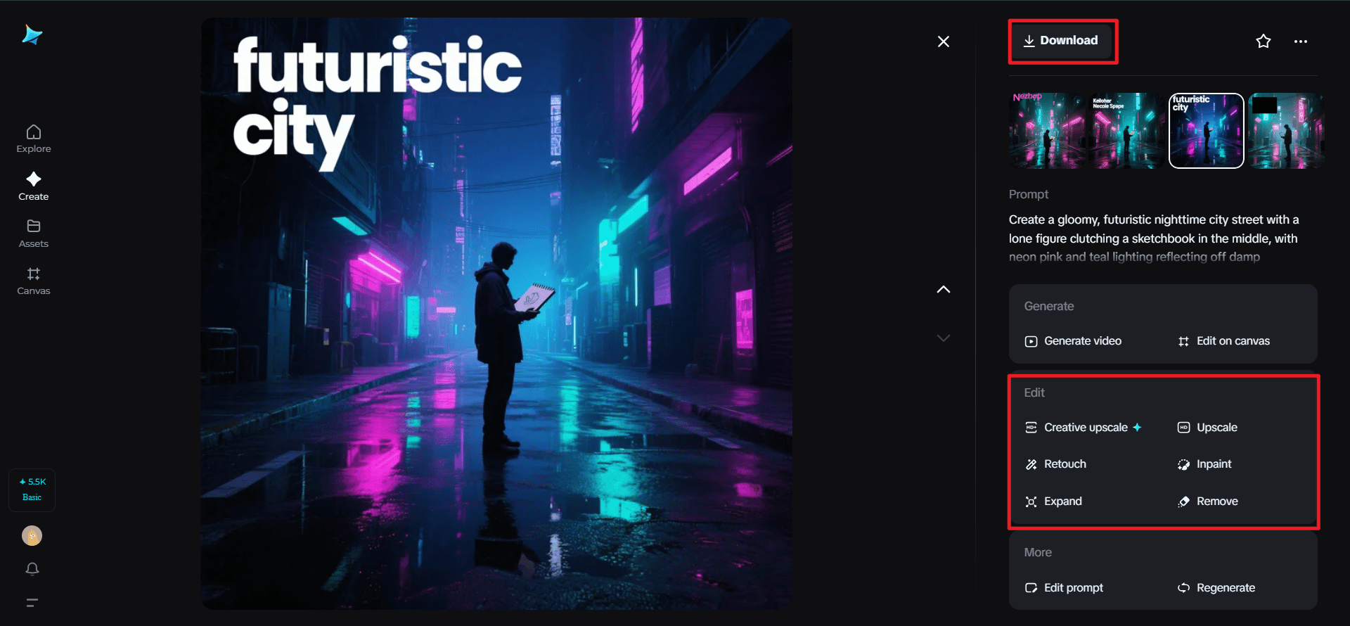
Step 1: Compose a descriptive text prompt
Go to Dreamina and set your hero splash—the picture that will launch the carousel. Specify mood, subject, and composition.
Here’s how: “Create a gloomy, futuristic nighttime city street with a lone figure clutching a sketchbook in the middle, with neon pink and teal lighting reflecting off damp pavement. For the headline text, keep the negative space in the upper left.“
That directive locks the visual tone that will lead future tiles.
Step 2: Set parameters and generate
Select a model that’s good for texture and detail of still-life, set the aspect ratio for Instagram (4:5 or 1:1 based on your crop), choose the size, and determine if you need 1k for quick experimentation or 2k for export. Hit Dreamina’s icon to create a few variants; choose the best one with the best focal point and copy-safe space.

Step 3: Personalize and download
Use Dreamina’s tools to inpaint minor areas (clear room for the headline), stretch canvas if you require bountiful bleed, eliminate distracting artifacts, and retouch color so that it reads on small devices. If the hero frame feels like the promise you wish to make across slides, press “Download” and use this master as the sequence’s keystone.
Production and Publishing Checklist
- Build a storyboard before you design slides; sketch thumbnails to test rhythm.
- Export high-quality PNGs, then compress for web to avoid pixelation.
- Write slide captions that add voice—don’t repeat on-image text.
- Schedule carousel posts at times your audience scrolls (mornings and lunchtimes often perform well).
- Pin an explanatory comment or a link to a longer article for readers who want depth.
Measuring Success: What to Track
Look beyond likes. Carousels are meant to deepen engagement:
- Swipe-through rate: how many people view the whole deck.
- Saves: a top indicator the content resonated.
- Shares: how often the post is forwarded to others.
- Comments: thread depth and conversational prompts in replies.
A high save-to-like ratio is especially telling—people keep your deck because it’s useful or inspiring.
Small Creative Rituals for Repeatable Quality
Create a template for margins and safe zones. Keep a short list of go-to type pairings. Maintain a folder of “motif” elements (color bars, corner stamps) so your carousels have a family resemblance without feeling cloned.
Conclusion
Carousels let you be a novelist and an artist in 10–12 thumbable pages. They reward curiosity and patience, and when executed with a cinematic eye and a clear arc, they turn casual scrollers into committed readers. Start with a strong splash (Dreamina will help you see it), plan your beats, and finish with an image people will want to save, screenshot, and talk about.
Hey welcome to my blog . I am a modern women who love to share any tips on lifestyle, health, travel. Hope you join me in this journey!

Speak Your Mind